Showing posts with label colour. Show all posts

Monday, 11 June 2012

Using Templates


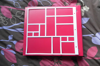
One of my favourite tools i have used in scrapping is the deceptively simple template using this template making effective layouts is simple. While I wouldn't use them for every layout when you are trying to fit allot of photos into a layout or want to make a bold statement a template is a good starting point.
template
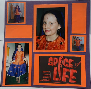
I have used this template for two different layouts with very different results. The trick is editing the template to fit your photos. The first time I used the template I got irritated with it very quickly as it is fiddly at some points. By the end of the layout I was so irritated that I didn't take the care I should of in sticking down my pieces. Despite this however it still turned out well.
Granville school spectacular Spice of Life
 The template was edited quite a bit for this layout to accommodate for the large photos but you can still see the resemblance in the general shapes in the layout. The papers I chose reflect the colours of the costume. The templates simple geometric pattern allowed me to be brave and choose bright contrasting colours that I don't usually use. Another feature of this layout is the use of a photo as the title (in this case a shirt). When taking photos for scrapbooking layouts look around for signs or words that could make a heading for your page. As a first attempt I was very happy with how this turned out.

a few years more experience and i decided to attempt this template again when once again I had more photos then i knew what to do with yet didn't want to make a double page spread
stereotype day
This time the photos allowed me to follow the template better and the extra experience made it simpler and les aggravating to work with. The result in my opinion anyway is a much more effective layout. The opportunity to use so many bright colours on the same layout makes this one of my favourite layouts to date. The vibrant colours really reflect the fun of school spirit weeks and help to brighten the dark photos.
~panda

tackling school photos: year 1


One thing about school photos is that they appear to be endless this is my year 1 layout and as with the kindy i have scrapped both the individual and the class photo. Unlike in the kindy page the teacher is in black which doesn’t inspire other colour choices. However it did give me opportunity to pick something random that contrasts nicely. i have always loved the pink and blue combination so I jumped at the chance to use it for this layout. i kept it fairly simple with a plain block colour as a background and then blue embellishments.  I used blue ribbon to add some shape to the layout placing it over the photos to add some dimension to the page.

I used the cricut paper dolls cartridge to create a school girl wearing a "uniform" in the same colours as mine and even found a hairstyle that matched my bob at the time. i found this served to fill in some of the empty space left by the smaller portrait as well as adding a little bit more interest to the page. Placing it on top of both the ribbon and the corner of the photo adds even more dimension to the page without the need for 3d adhesive blocks. The bow on the ribbon in the top left corner also serves to add both texture and dimension. 

The second page of this layout I kept as a simple mirror image of the first, removing the extra embellishments (bow and school-girl) so the focus will be more drawn to the image. Although the image is bigger the individual elements in the image are smaller so any big embellishments would only serve to crowd the page and remove attention from the image.
~panda

Thursday, 7 June 2012

tackling school photos: kindy

another older creation
i always find school photos are hard to scrap. they tent to always have the same colour scheme and i like scrapping both the individual and the class photo so i can also remember who was in my class. the addition of the class photo to a layout can be difficult though as this means including the name list as well. even on a double page layout this leaves little room for decoration. this kindy page took me forever as the butterflies came from cricut offcuts i was given and i am fussy but eventually i finished it off. using ink to colour some white butterflies into the colour scheme which i found added a lovely texture to the page. Finished with some kindy glitz to add a little bit more sparkle. Here is the finished product.


to combat the colour scheme in school photos and preventing all your pages becoming monochromatic i find using other colours that have been introduced into the photo (in this case the teachers dress) another technique is to use a bold colour that contrasts the pictures. in this example the warm tones of red brown and yellow contrast with the cool blue of the photos. this means despite the elements on the page the photos are still the focus.
~panda